


Firula Doces

Overview
A playful confectionery identity inspired by the color, texture and joy of sweets.
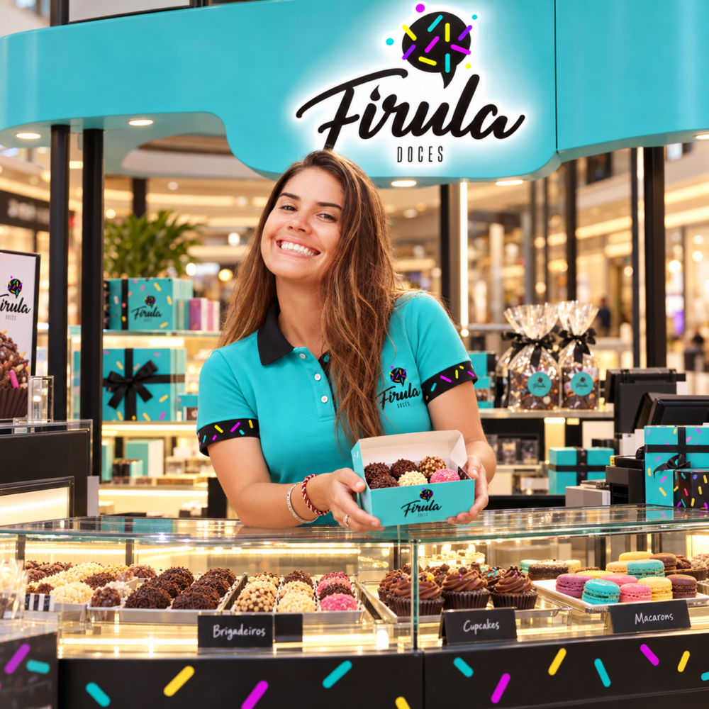
Firula Doces is a confectionery brand based in Curitiba, Brazil. The project translated the world of sweets into a distinctive visual identity, combining expressive lettering, vibrant accents and a graphic pattern inspired by sprinkles.

Industry
Food & Beverage / Confectionery
Services
Brand Identity
Art Direction
Logo Design
Visual System
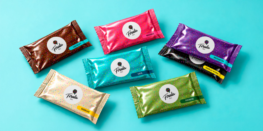
Packaging Design
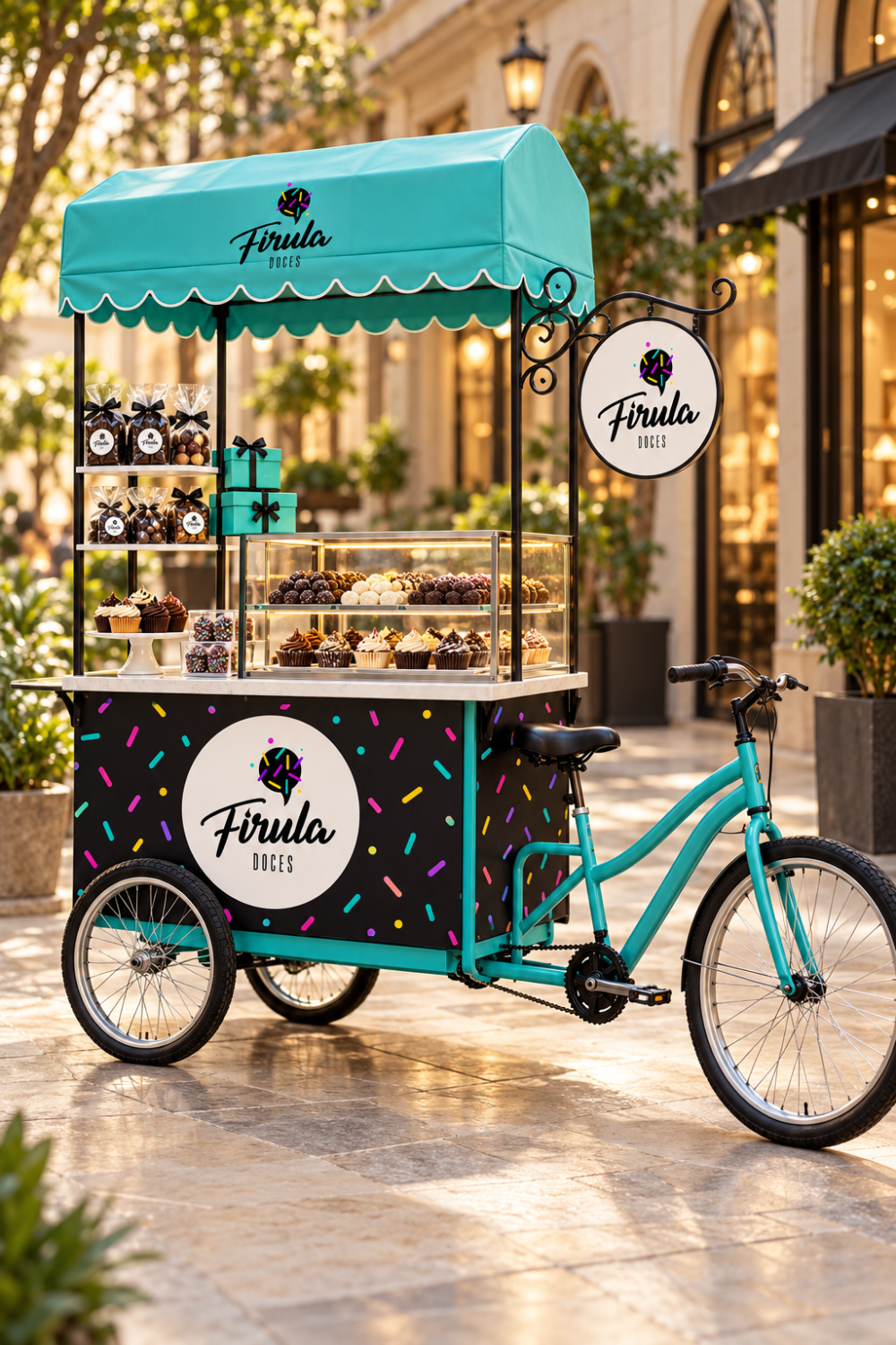
Brand Collateral
My Role
I developed the visual identity, from logo exploration to the design of supporting graphics and brand applications. The work brought typography, color and packaging together into a cohesive expression of the brand.
The Challenge
The design challenge was to communicate sweetness and personality while creating an identity that could work across small labels, packaging and printed materials.
The brand needed a recognizable signature and enough flexibility to support different products without losing its character.

Visual Identity
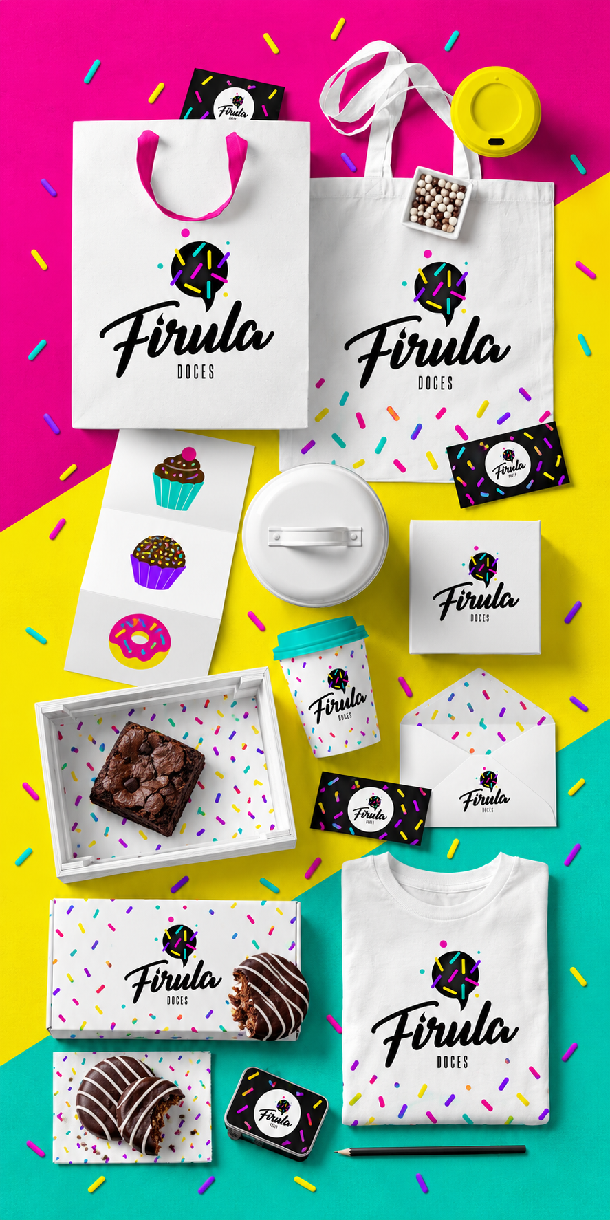
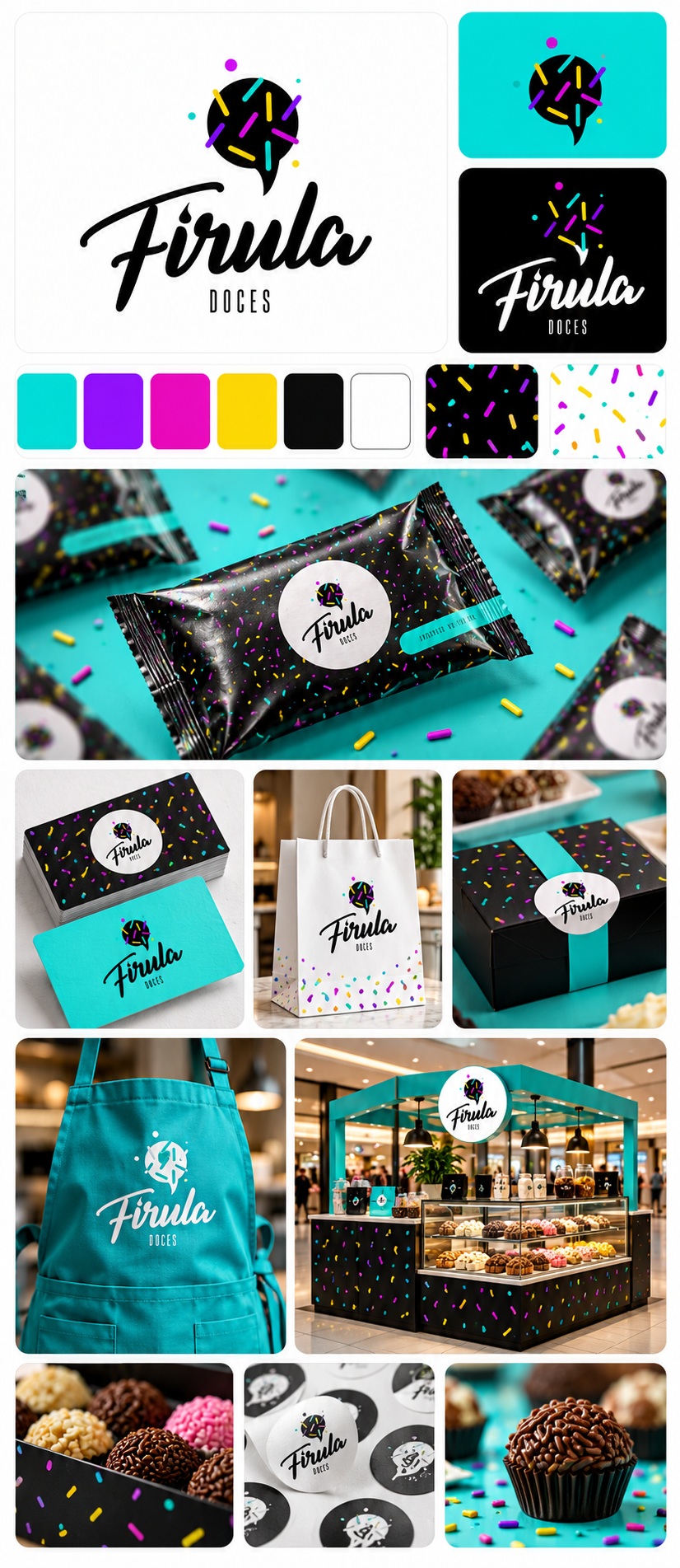
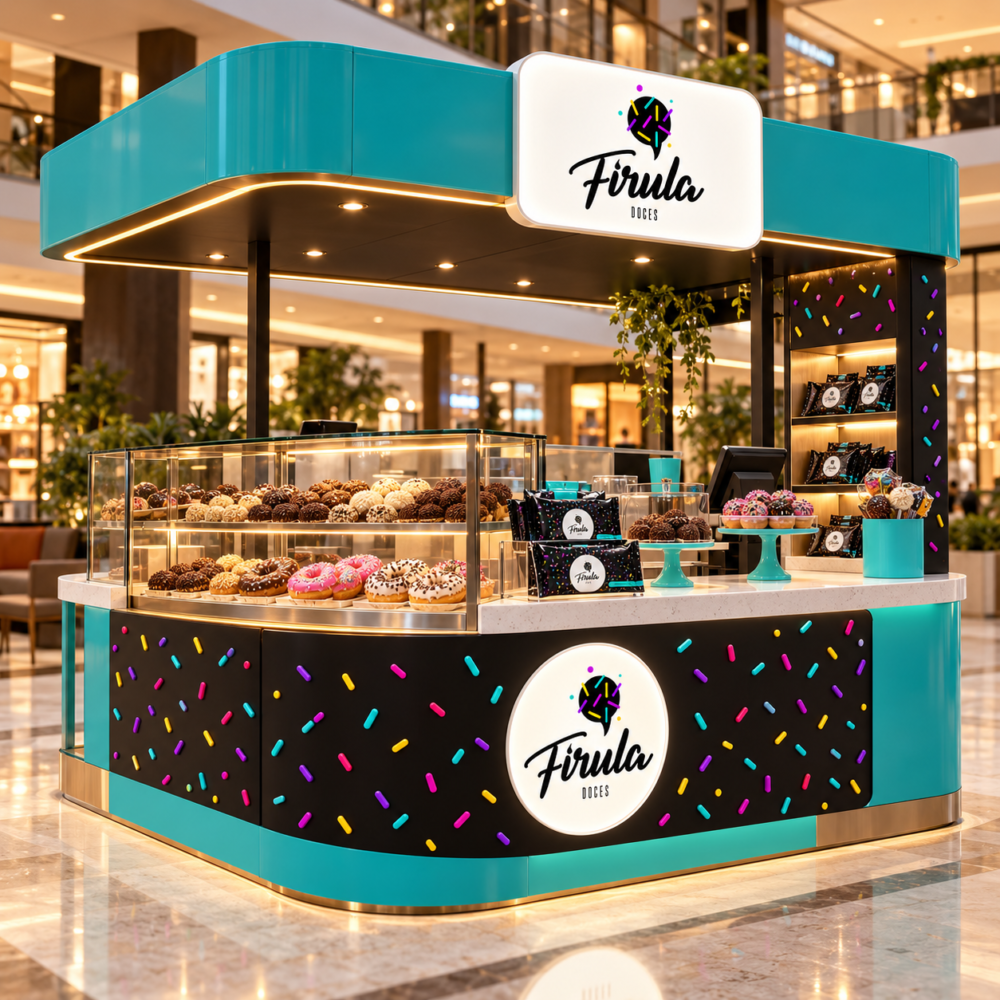
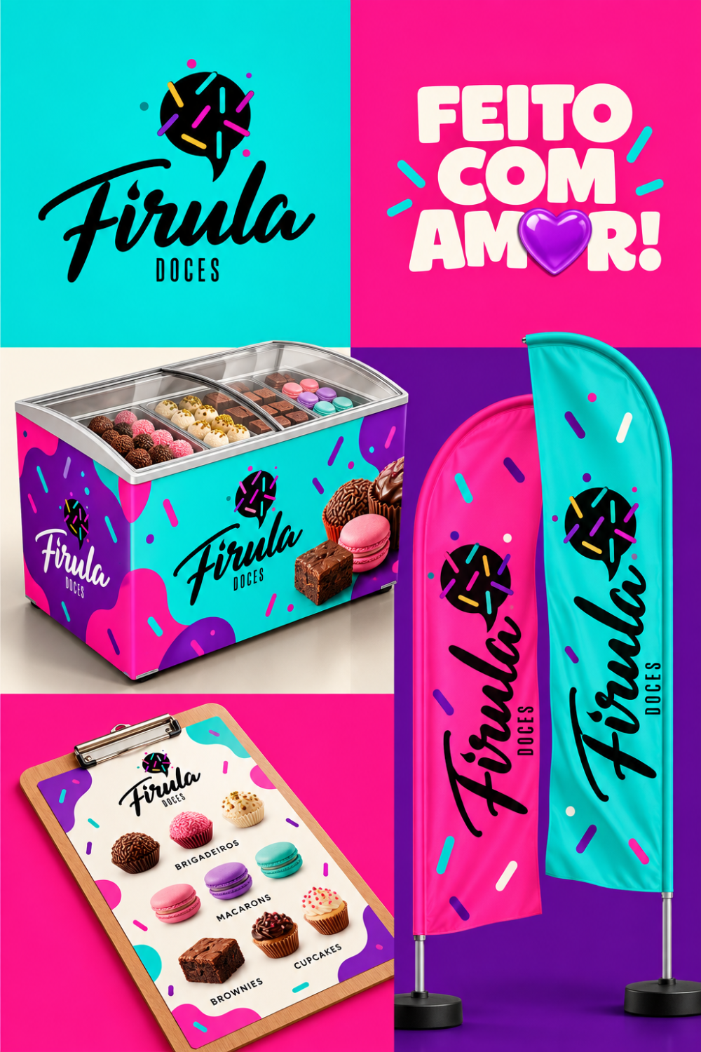
Expressive script lettering gives the Firula name a friendly, personal feel. A confectionery-inspired symbol connects the logo to the product, while circular compositions provide a compact format for labels and packaging.
Turquoise brings freshness to the palette. Black and white create contrast, allowing the colorful details to stand out.
Visual System
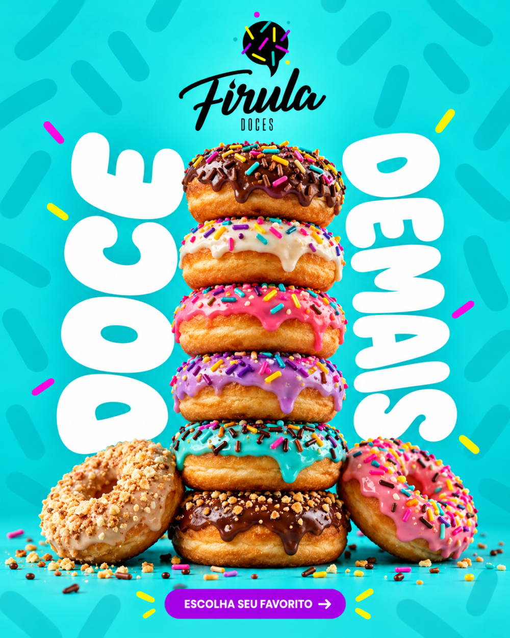
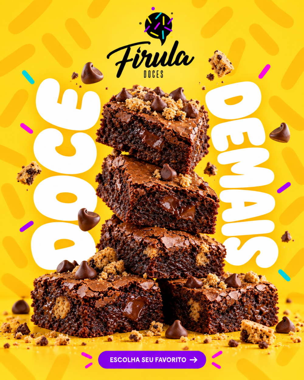
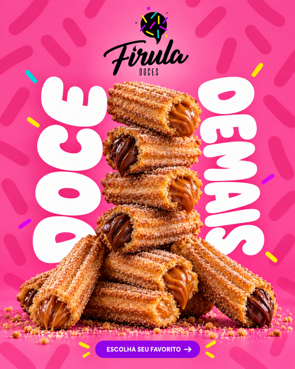
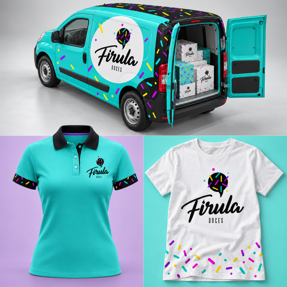
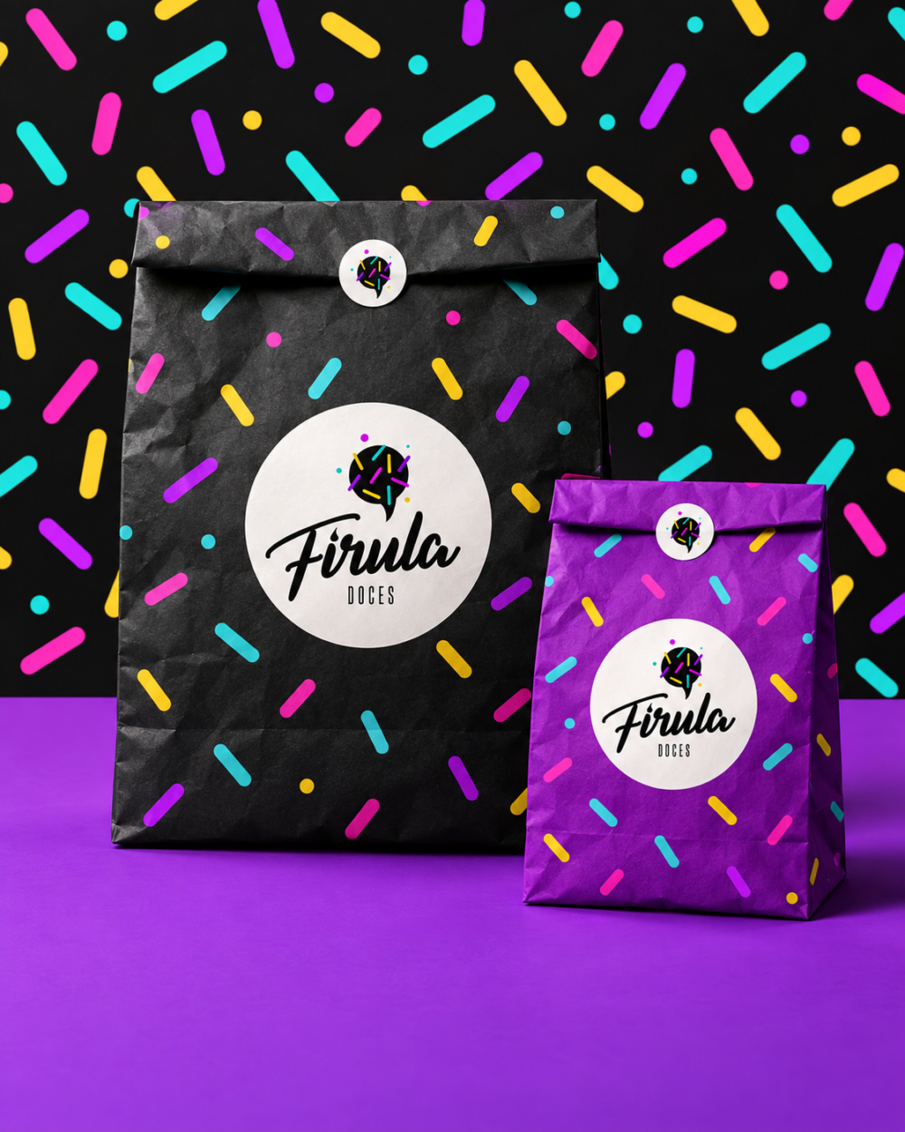
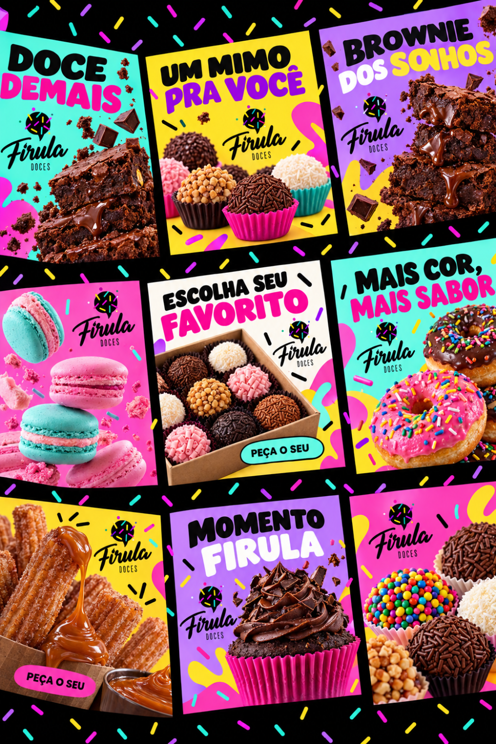
A recurring sprinkle pattern extends the identity beyond the logo. Turquoise, yellow and purple accents introduce movement and texture, turning a familiar confectionery detail into a recognizable brand element.
The pattern works on both light and dark backgrounds, giving the system variety while keeping its applications visually connected.
Packaging & Applications
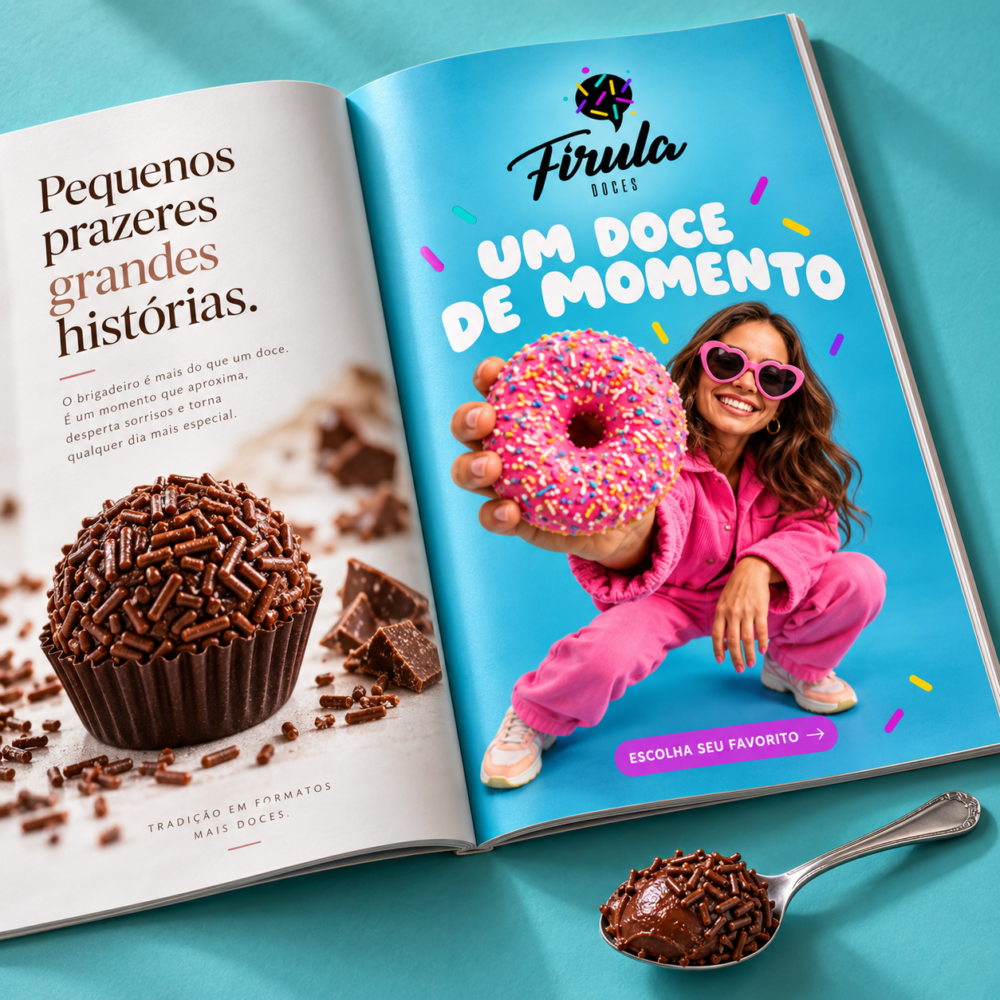
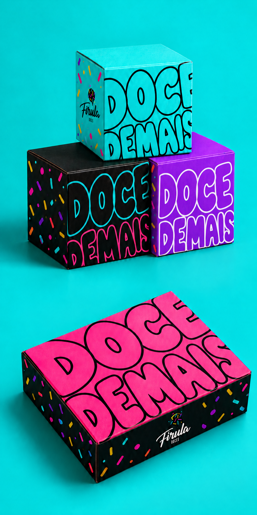
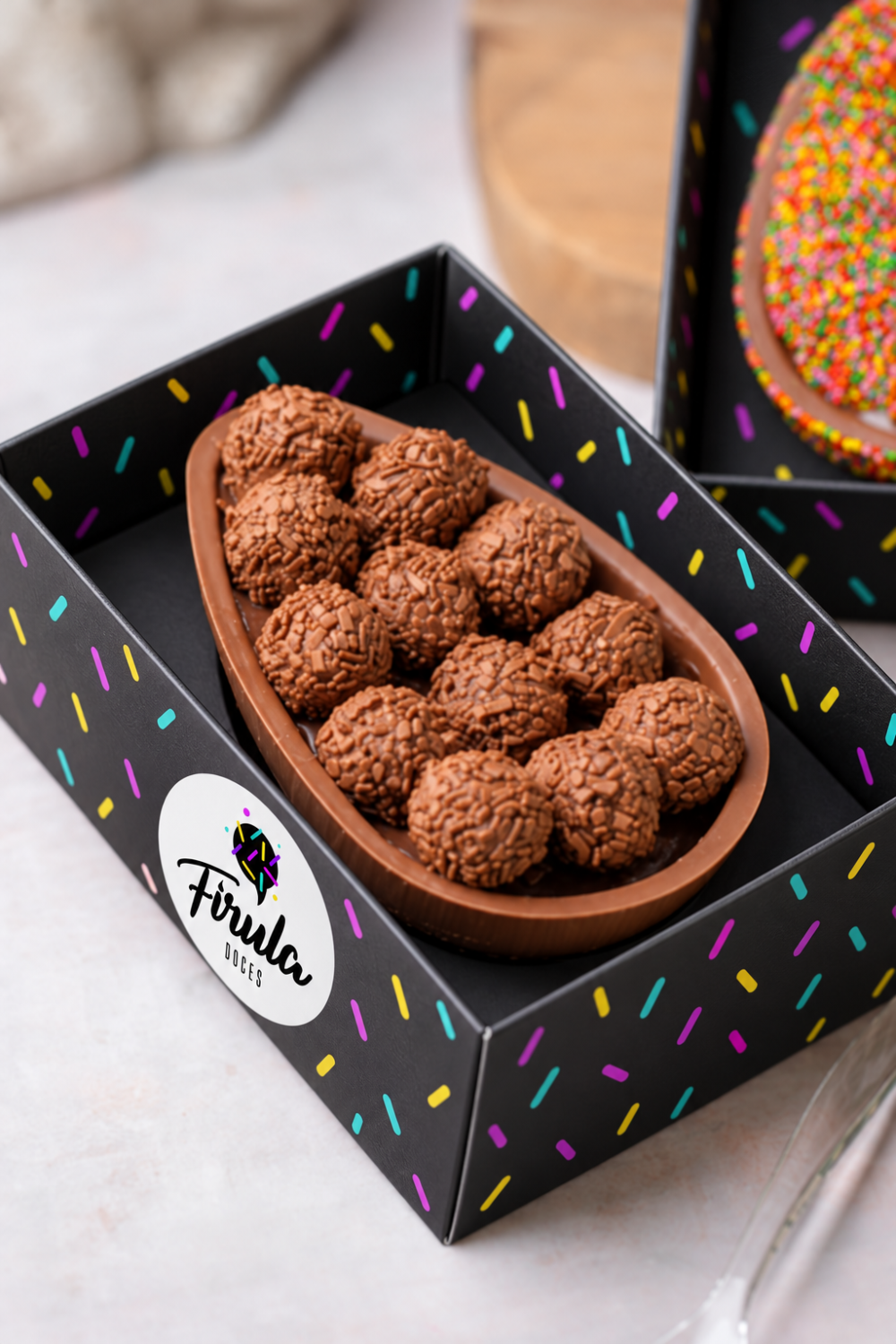
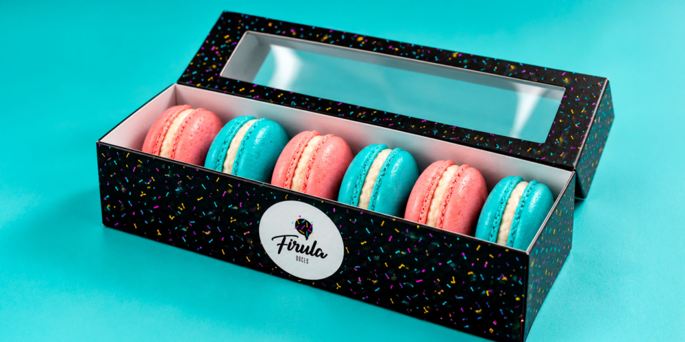
The identity was explored across product packaging and business cards. Dark packaging creates a bold backdrop for the colorful sprinkles, while white logo areas establish a clear focal point.
These applications show how the brand can balance playful decoration with readable information and consistent recognition.



Outcome
The project brought together a distinctive logo and a flexible graphic language for Firula Doces. Lettering, color and pattern create a cohesive identity that carries the personality of the brand from its signature to its packaging.


Compartilhar


